

Redesigning the visual identity system for multi-faceted educational brand

Overview
Introduction
This project was implemented in fist half of 2017. Previously I worked in Cheese Education as an assistant designer responsible for graphic design and audio-visual materials associating their marketing department. Then, the founder of Cheese Education wanted to updating their visual identity system because of new business goal, it is honoured that they gave me the opportunity to redesign their new branding system as a cooperative contract and regarded me as a independent designer with my own team.
Because of the confidentiality agreement, I cannot publish all the output here. This page only shows some examples of the whole project.
Client
Chyeth Education Group
Team Members
Mengru Zheng
Xiaomin Tang
About CHYETH
The founders of Chyeth owned two companies, Cheese Education and Andrews Preschool. Cheese Education focused on problem-based learning extracurricular education plan for K-12 students, and Andrews Preschool focused on liberal and art education for preschoolers. In 2017, they decided to integrate both brands into an educational parent brand.
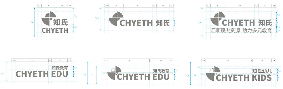
In their new strategy, CHYETH is parent brand, while CHYETH EDU and CHYETH KIDS are subsidiary brands, focusing on K-12 education and preschool education. During design process, I should consider how could logo develop if they could expand their commercial affairs in the future.
Logo
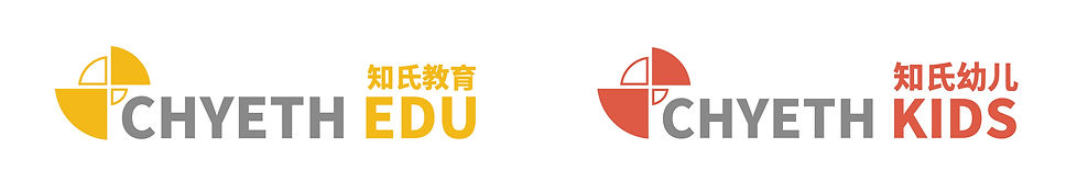
Since “Chyeth” is a combination of “Cheese Education” and “Andrews Preschool”, the new branding system should ensure its relevance with original brands. According to the discussion with our client, we focused more on how to abstract the shape of “Cheese”. Therefore, the new logo includes abstract plan view of sliced cheesecakes, with different colours, so that its subsidiary brand could utilise one of these colours for subsidiary branding.
According to their business strategy, 4 sectors with different colours stands for their core value proposition. “Chyeth” proposed that education shouldn’t only focus on score, and students should also develop multiple fields of vision, such as culture, economics, technology, public benefits and so on.
The translation of their slogan is: we integrate best institutional resources to associate multi-faceted education.

Limited Use Logo & Primary Logo
Primary Logo for Subsidiary Brand

Mono Reverse & Monochrome
Clear Space
Minimum Size

Auxiliary Graphic

Colour Palette

Typography

Example
Business Card

Envelope

Writing Paper

Post-it

Employee's Card

Trophy & Certificate

Powerpoint Template


Wayfinding


Tape

Showcase

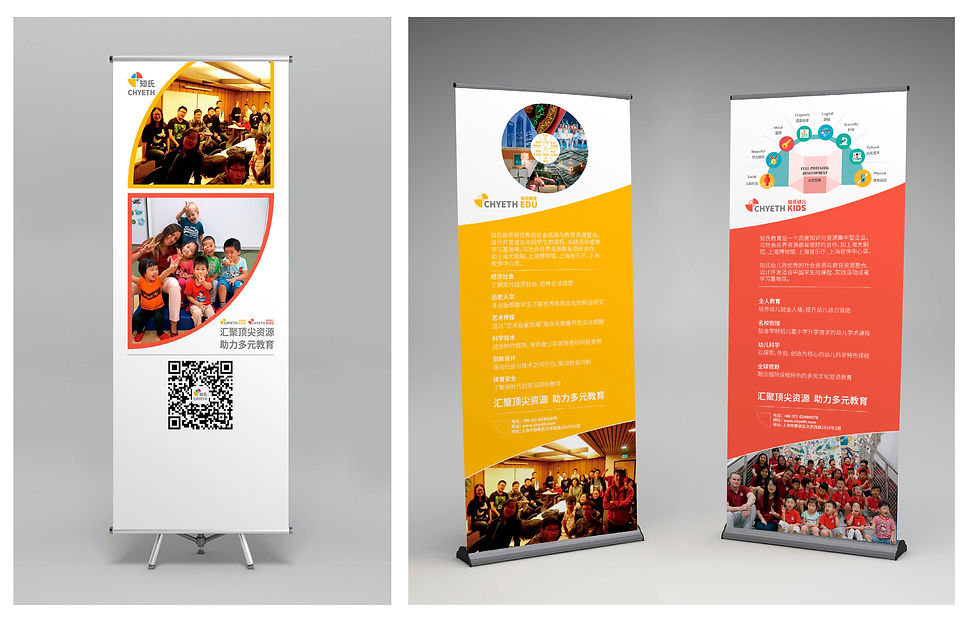
Pull Up Banner
Poster

Brochure

Greeting Card

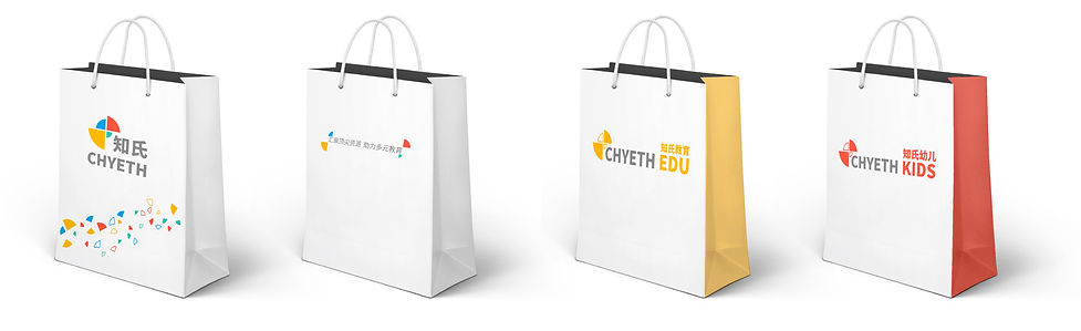
Paper Bag
Mug


Digital Recruitment Notice
Lightbox Banner
