

Visual identity system for a startup, business affairs of which focusing on AR, VR, and digital KOL technical support

Overview
Introduction
This project was implemented from mid-December 2021 to end of January 2022. This is a teamwork of two team members as a commercial branding project. In initial conception stage, two team members provide different logo choices for the client. Then, once the final chosen logo was confirmed, my contribution was the basic VI guideline, PPT template, and way-finding assets, and my team member, Xiaoying Li, made most of stationary assets.
Because of the confidentiality agreement, only limited content could be listed in this page.
Client
Team Members
Mengru Zheng
Xiaoying Li - One in Lee Strategy & Design (Guangzhou) Co., Ltd.
About Yi Lan Tech
Yi Lan Technology, previously named Wei Lan Technology, was incubated by Tsinghua University in June 2021. The core business services of Yi Lan Technology are immersive digital content and 3D engine, which provide computer graphics KOL and real-time VR, AR & XR interaction with technical support and innovation.
Conception
During the first focus group with our client, elements such as purple color palette, unicorn and character “Y” should be included in further conception stages. Furthermore, their slogan, “观水有术,必观其澜。”, is full of Chinese philosophy, which literally means strategically observing water and finally you can see wave.
Then, in the second focus group we benchmarked logos of competitors as well as visual trends in technology industry, and discussed with our client based on mood board keywords: Unicorn, Universe, Technology, Mountains & Water.
There were 3 main stages in initial logo iteration. In the 1st stage we provided 4 options with different design languages, and our client liked 2 of those options. In the 2nd stage, clients asked us provide more iteration based on option 2 to be compared with option 4 in previous stage, and finally they decided the unicorn face with cyberpunk aesthetic language. Finally, in the 3rd stage, we provided 4 options for character “W”, in case they might need to update their original brand Wei Lan Technology in the future.

Final Logo
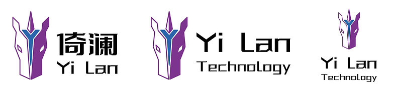
The final logo includes the front face of a unicorn and an accessory in Y shape.
Above all, we use purple and blue in high saturation and contrast for a technology impression. The founders of Yi Lan have academic background in NYU and Tsinghua University, which is the core reason why purple should be the main colour. Also, it is illustrated with polygon shape, because polygon modelling is a core technique in digital art and meta-verse technology as per the business strategy of Yi Lan Technology. The Y shape seems like a battle helmet in middle Ages, moreover, the polygon shape combined tech style, E-sport style and Cyberpunk style according to target groups of our client. Finally, we referenced Minecraft as a meta-verse precedent, hence, the logo also seems like a tiny architecture in isometric view.
Primary Logo

Optional Logos
Monochrome

Mono Reverse

Logo in Slogan

Clear Space

Minimum Size

Colour Palette

Auxiliary Graphic
The auxiliary graphic was inspired by neon light, which is a key visual element frequently used in science fictions and cyberpunk artefacts.


How to Use
More Possibilities

Typography

Example
Business Card

Employee's Card

Post-it

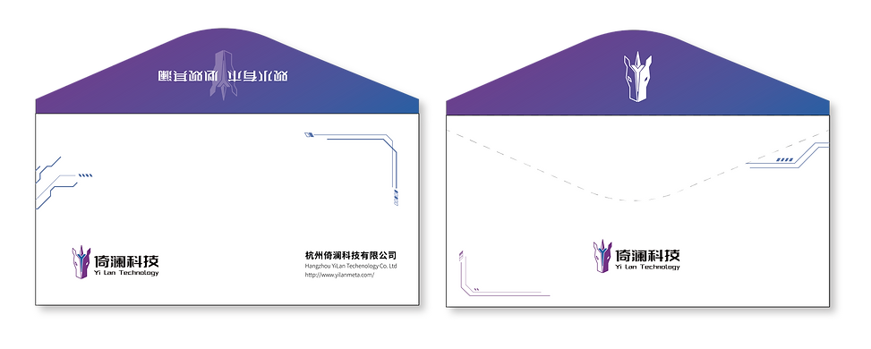
Envelope Folder

Zipper Folder

Disposable Cup

Tape

Powerpoint Template

Screen Saver

Floor Sign

Door Plate


Concierge Desk
Background Banner Template

Arcade Box

Invitation Card

Envelope
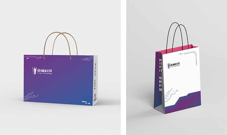
Paper Bag
Polo Shirt & T-shirt
